Explanation of maps
There are four main types of map accompanying the species texts in this Atlas.
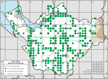
1. Breeding distribution

The breeding distribution maps in this Atlas show the highest level of breeding status recorded in a tetrad in any of the years 2004–06. They have three different sizes of green dots representing the three categories of breeding status:
| Large dot | Confirmed breeding | |
| Medium dot | Probable breeding | |
| Small dot | Possible breeding |
All the percentages have been calculated exactly but
rounded to whole numbers: occasionally rounding errors mean that the total appears to add up to 99% or 101%.
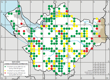
2. Change in breeding distribution

These maps compare the breeding season results of this Atlas with our First Atlas of 1978–84. For most species, the comparison only concerns presence during the breeding season, not taking account of which of the three categories of breeding status was recorded. For a small number of species, the main changes are blurred by records of birds on passage or late wintering or 77 immature non-breeders, so 'change' maps are presented of 'confirmed' or 'probable' breeders only. These maps have three colours of dots, all one size:
| Green | Present during 2004–06, not during 1978–84 ('gain') | |
| Yellow | Present during both Atlases | |
| Red | Present during 1978–84, not during 2004–06 ('loss') |
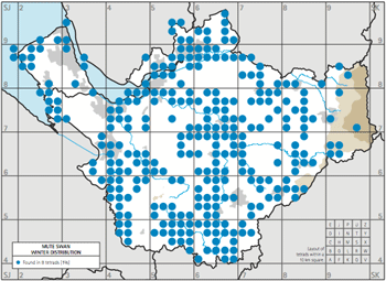
3. Winter distribution

These maps show the species' presence during winter (16 November to end of February) in any of the winters 2004/05–2006/07. These maps have blue dots (![]() ), all one size.
), all one size.
There has been no previous survey in winter at the tetrad scale. The county was surveyed by 10 km squares in 1981/82–1983/84 as part of the national BTO Winter Atlas, but there is no species where the comparison at this coarse scale reveals anything, so no 'change' maps are given.
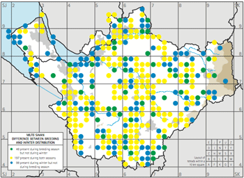
4. Difference between breeding and wintering distribution

For some species it is instructive to depict the difference between the breeding and wintering distribution during this Atlas. In many cases different populations of birds, from different origins, are involved, and it is not implied that the same birds are present in the two seasons. These maps have three colours of dots, all one size:
| Green | Present during breeding season but not during winter | |
| Yellow | Present during both seasons | |
| Blue | Present during winter but not during breeding season |
Other maps
For the species that bred in the county during our First Atlas but do not breed here now, the breeding distribution map is reproduced here with three sizes of brown dots using the same convention as (1) above.
For 35 species, breeding abundance maps are presented, using colours contoured in 10 shades from pale yellow to dark brown. These maps contain a legend giving the species' density in units of birds per square kilometre. This figure can be multiplied by four to give a density in birds per tetrad.
For a few species there are extra maps depicting additional features of interest, such as the differences in the distribution of Lesser Redpoll and Siskin in the three winters, and roosts of a number of winter species with conspicuous communal nocturnal gatherings.

